I wandered into Foyles, Charing Cross the other day and as per usual started to peruse the YA section. And what struck me were just how many gorgeous covers are gracing the shelves at the moment.
When I started working at a publisher, one of the coolest things I got to do was sit in on cover meetings. There's so much thought and creativity that go into these covers guys, you don't even know!
I've picked out some of my favourites below so you too can have beautiful bookshelves forever.
I've picked out some of my favourites below so you too can have beautiful bookshelves forever.
Gorgeous Illustrations
 |
| Absolutely gorgeous colour palette here. Faber & Faber |
 |
| All of Alexia's covers are beautiful, but this one especially pops. Faber & Faber |
 |
| Hot Key covers are always great, but this is one of my all time favourite covers! The creativity, the layering, the colours... masterpiece! Hot Key Books |
 |
| I knew nothing about this book before, but its spine's hand drawn lettering stood out and I'm so glad it did. This is also an Amnesty International title. Walker Books |
 |
| I love how you immediately get the essence of each character from such a simple concept. Chicken House |
 |
| Does anything really need to be said... The eye of the feather on the dust jacket is a cut out revealing... |
 |
| I mean come on! |
 |
| And the back! Macmillan Children's Books |
 |
| I had to check this was in the right section as it looks like something that would be shortlisted for the Booker. It is wonderfully sophisticated! Algonquin Young Readers |
 |
| There is massive love for Noelle Stevenson who illustrated this cover (and Nimona which is excellent!) I love the idea that an artist with a fanart style was selected for a title about fanfiction. Inception! Macmillan Children's Books |
 |
| Simple and brilliant - perfectly conveying the book's message without a single word. David Fickling Books |
 |
| Lovely to see a recognisable in-house style emerging from DFB. This is also the 2nd title DBF have shortlisted for the 2016 YA Prize, including the title above. David Fickling Books |
 |
| HarperCollins getting in on that matt action. Stunning! And nice to see different representations of body sizes also. Harper Collins |
 |
| Anyone else getting a Juno vibe? Headline |
 |
| Excuse my terrible photography here - link to better image. Beautifully illustrated (sadly I cannot find out the illustrator from the web) - it really pulls you in to the characters and story. OUP |
 |
| Anything hand illustrated it attractive to me, and so I will naturally love the cartoony look of this cover! Hot Key Books |
 |
| The illustration combined with the foil finish on the title is so well done. There's an instant atmosphere! Hachette Children's |
 |
| I really like the layering and use of colour here. Swoon Reads |
Graphic
 |
| To me this looks ever so slightly like a nipple and areola. But a very nicely designed one. David Fickling Books |
 |
| Love the background blue which is a gorgeous colour in and of itself. Combined with that striking title and the image of the doll behind is a very mature looking cover. I like that nothing was 'dumbed down' for the teen market. Quercus |
 |
| The colour palette is really standout here, but the use of braille elevates this to another level, which could have been easily overlooked. Harper Collin's Kids |
 |
| I really rate the simplicity of this design, taking the familiar image of a generic stick man and messing with it. Also love the perspective. It also reflects the two character well. Faber & Faber |
 |
| People love this cover, and I can readily see why. Look at that holographic finish! Electric Monkey |
 |
| Now I know this is a pretty standard cover, but I like the inverted use of the image. I think it nicely reflects the closing in of the maze around the characters (yes I'm a douche). Chicken House |
 |
| Set in Japan, this cover is striking and evokes the appropriate sombre mood. I would question the fonts used in the title but I'm just being picky now. Definitions |
 |
| Love the varying use of colour the layers and the cut paper/diorama feel to it. Atlantic Books |
 |
| Do you remember in Word everyone used to use the colour fade tool? This is the only contex in which that ever looks good. Amazing pallette and arresting image! Bloomsbury |
Other things that are awesome
 |
| So it may be hard to see, but this is a high shine finish (looks like oil - that's my reflection). The figures are cut outs with a beautiful end paper underneath. It's understated but cool! I also like that it has 'no title' aka Zombies vs. Unicorns by Holly Black. Margaret K. McElderry Books |
 |
| Okay so this is a book I found by accident and it is just beautiful. Look at the cover for one - the photo is lovely, the models are relaxed which is hard to do and the title is awesome! Razorbill This book gets special treatment with a look inside because it is brilliant. A visual love story, it is a great mix of photography, written pieces and interesting spreads. Really great for art lovers! |


 |
| Firstly, the image is very cool. Really like the exposure and saturation of the image, and the wibbly effect of the writing really accurately reflects the themes throughout the book of patchy memory etc. Hot Key Books |
 |
| This seems to be on everyone's shelfies - and I can see why. This photo perfectly sums up the feel of the book - the title placement is genius and it feels like an Irvine Welsh cover! Penguin |
 |
| Love the stark white background with the massively colourful inverted title. So pretty! Corgi |
 |
| Simple but massively effective, I just really like the muted colour palette here and the placement of the text. Understated but impactful for me. Bloomsbury |
Series - because it's hard to get one cover right, let alone doing it multiple times.
 |
| These are really great covers that truly capture the essence of the book. Not sure why they changes the style halfway through but I think I prefer the Dickensian style cover of the far left. The illustration style across all though is superb. Hot Key Books |
 |
| Nicely tapping into the inspirational meme aesthetic here, these covers are young but interesting and not too literal. Really like the vibrant but not overly saturated colours. Hot Key Books |
 |
| I love that these look like old travel posters with a pop-art edge. Get on my shelf now! Walker |
 |
| Does anything really need to be said? Stunning! I know the old saying is don't judge a book by its cover, but I judge these most highly! I have since bought the first book because I simply have to have them! Curious Fox |
 |
| Yet another beautiful use of colour - the watercolour effect is inspired (often cover designers hand paint these). Harper Collins |
 |
| Call me a contemporary snob, but often contemp covers can be boring and a bit two a penny. These are anything but - simple, classy and nailing that very hard to do trope of having a person on the front cover. Bravo, Scholastic |
 |
| Love the popping use of colour here, the simple style and the recurrence of the same palette and styles through unrelated books. I like when authors' books have a running style, it makes the such collectors items. Andersen Press |
 |
| Another gorgeous and certainly hand-painted series, I personally think the newly released Raven King is the best in the series with that deep blue. Plus I love deer! Scholastic |
 |
| Brilliantly dark, this series is about cannibals. Not that you'd know it overtly from the cover, but you know something isn't quite right. Love the tag lines too! The illustration style is great - love the use of shadows in the first cover and the hue of pinky/red in the second. Hot Key Books |
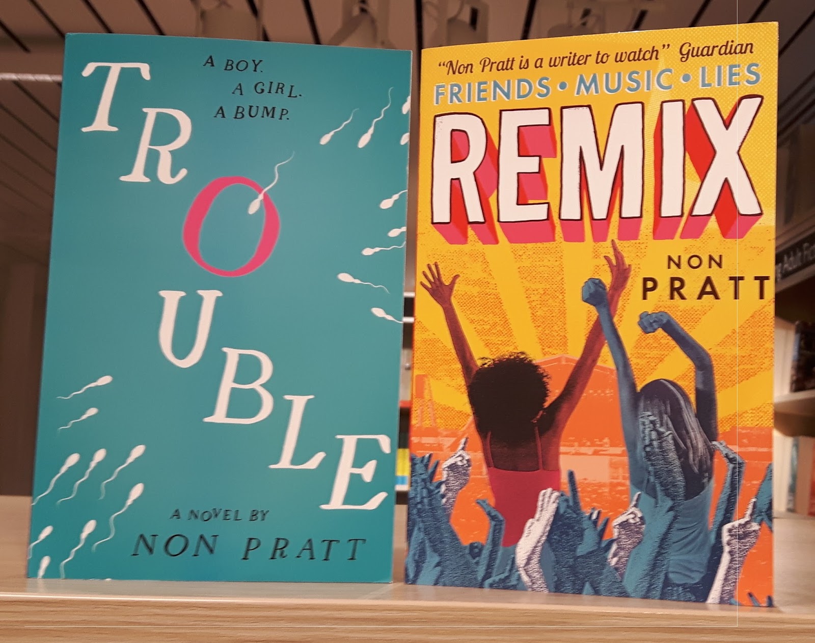 |
| Not a series, but similarly to Susin Nielsen's books, these designs are cohesive but not a pair. What isn't there to love about Trouble and Remix's bright colourful palette screams summer festival. Walker |
Examples of what not to do - these covers hit certain tropes that I just really can't stand.
 |
| I hear many a good thing about this book/series, but the cover just turns me right off. The odd person staring out from the cover with the hugely foreboding background is just bleh. Also, the font looks really amateur to me, but that's just my opinion. |
 |
| Again, I feel quite amateurish - like I could put this together with paint myself. Again, I hear great things about the book but the cover doesn't make me want to buy it. I have since seen re-worked versions of this cover which are much better. |
 |
| Sigh... TV/Movie tie-in covers... I can forgive Beautiful Creatures because the cast is so awesome and the styling is great, but generally I dislike them. I understand why we do them, I just personally chose not to own them. The newest TMI cover is just... eugh... not good! Angsty image of Clary looking intense. I don't like the show anyway, so highly unlikely to like the cover. Sorry! |
 |
| This one isn't that bad, I like the contrast of colour etc. but it's just a bit cliché and unoriginal. It looks like a bad romance novel my auntie would read on holiday. |
 |
| Eugh... see all of the above. I know he's dead, but could they have any less connection/chemistry? |
So those are my thoughts on book covers out at the moment (or those I could find in the YA section of Foyles, Charing Cross). Do you agree/disagree with any of these? Which is your favourite? Any gorgeous covers just come out/due?
Let me know in the comment below!
Bookish love,
Rachel xx